
With its deadline at the end of the month, a panel tasked with finding new symbols for Minnesota has honed in on three flag designs and finalized a design for a new state seal.
The State Emblems Redesign Commission on Tuesday chose three final concepts from the more than 2,000 design submissions it received from the public in October. Members entered Tuesday’s meeting with six finalists from their meeting in November. After voting, they whittled their choices down to three.
“I thought all six were strong, but emerging from public opinion and what I had heard and feedback from people from fellow Minnesotans, these were the top three that I think are the most unifying,” said Vice Chair Anita Gaul, who told reporters she expects the commission to narrow its choices to one finalist when members meet again Friday.
All three final designs bear a single star and include one or more shades of the color blue. Two include the color green. And if you use your imagination, one appears to feature a loon, a feature its designers called a “happy accident.”
The final flag the commission recommends for the state to adopt may not exactly resemble the designs in their current form. Each design already has multiple alternate versions, so a star could get a different number of points, or a color could be added.
Professional designers may also have a look at the final design and make recommendations on any final changes.
The 13-member panel is required to finish its work by the end of this year, and the state will have to adopt a new seal and flag by May 11, unless state lawmakers reject their recommendations.
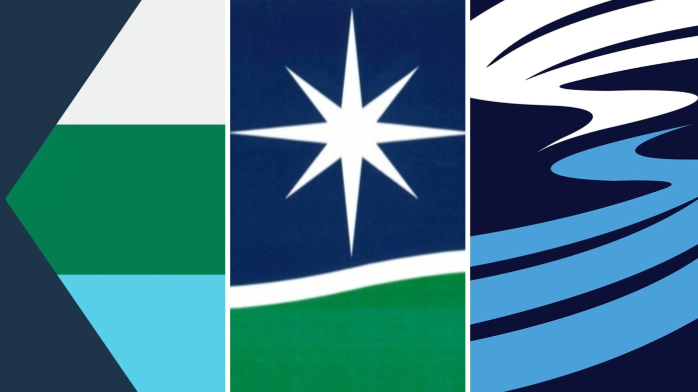
Final 3
In first place was a flag with white, green and light blue horizontal stripes and a navy blue section on the left that mimics the shape of Minnesota. In that section is an eight-point white star meant to symbolize the state’s motto “Star of the North” as well as unity in a diverse land.
One of the finalists for the Minnesota state flag design as selected by the State Emblems Redesign Committee in St. Paul on Tuesday, Nov. 21, 2022. (Courtesy of the State Emblems Redesign Commission)
The white stripe symbolizes snow, the green stripe represents nature and agriculture, and the light blue stripe represents the state’s waters — from its more than 10,000 lakes to the Mississippi River.
Its designer is 24-year-old Luverne resident Andrew Prekker, who says the “swallow tail” design is unique among flags of the world, and that he wanted to keep the design as simple as possible.
In second place was a design with a white star on a blue background above a green bottom half. The green and blue are separated by a white line to symbolize the state’s abundant winter activities. Its designer is John Muller, a former Minnesota resident who now lives in Texas. He flew to visit the commission’s hearing on Tuesday.
One of the finalists for the Minnesota state flag design as selected by the State Emblems Redesign Committee in St. Paul on Tuesday, Nov. 21, 2022. (Courtesy of the State Emblems Redesign Commission)
In third place is a blue and white wave-like pattern symbolizing the significance of water to the state. According to its designers, it “pays tribute to Minnesota’s diverse and dynamic landscape, with wisps of snow, clouds, and aurora reflected by pristine, bending waters, and a guiding, four-pointed North Star inspired by the symbols and astronomy of Dakota and Ojibwe tribes.”
One of the finalists for the Minnesota state flag design as selected by the State Emblems Redesign Committee in St. Paul on Tuesday, Nov. 21, 2022. (Courtesy of the State Emblems Redesign Commission)
It was designed by Peter Pitman and his son Todd Pitman of St. Paul. While it’s hard to see, they say two loons appear in the design, something they say they noticed during the design process.
Seal design updated
Commission members had already selected a new state seal design during their meeting last week, but on Tuesday they made a few modifications.
The design still centers around a loon, Minnesota’s state bird, and it’ll still feature waves to symbolize the state’s lakes, wild rice to symbolize agriculture and trees to represent forests.
However, the commission stripped the state motto “L’etoile du Nord,” French for “Star of the North,” from the final seal design and replaced it with the Lakota “Mni Sota Makoce,” a phrase meaning “Land Where the Waters Reflect the Clouds.” The phrase is where Minnesota gets its name.
Members also voted to remove the founding year of the state from the seal, 1858, after some members raised concerns that the year was a painful reminder for Native Americans of land cessions tribes made when Minnesota became a state.
Related Articles
Minnesota flag finalists to be on display at Mall of America this weekend
MDH to host virtual hearing on Allina moving adolescent mental health beds from St. Paul to Minneapolis
Minnesota expects $2.4 billion surplus, but shortfall on horizon
DFLer Bianca Virnig wins special election for vacant Dakota County House seat
Panel names top pick for state seal. It’s the only one with a loon.
Leave a Reply